Want create site? Find Free WordPress Themes and plugins.
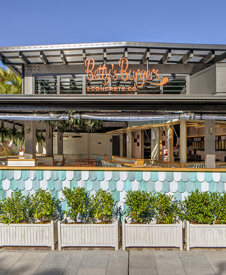
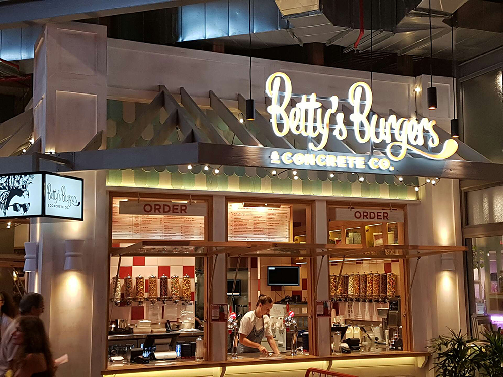
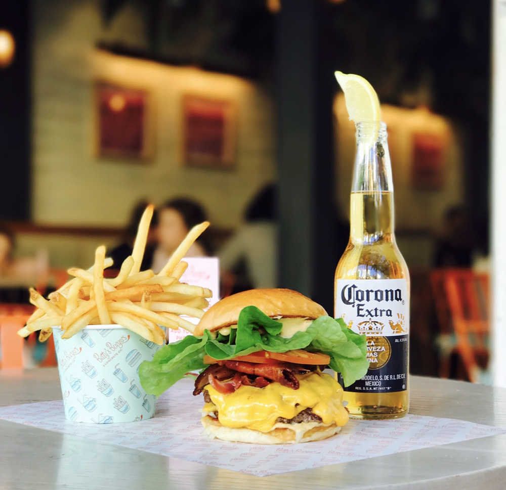
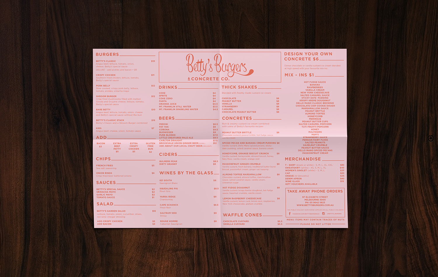
The brief provided was 1950-1960’s Americana beach burger shack. We interpreted this with the use of custom typography and colour palette, along with the styling of the secondary language icons and patterns.
As Betty’s is a rapidly growing business, with 8 stores opened within 2 years (and many more to come), the collateral & packing needed to be very cohesive and tight—from the food packaging to the Betty Burgers menu—so every venue has the same feeling as well as a system that can be rolled out from one head office to compete with the booming new-age fast food industry.
Branding and Design Work:
Identity | Hospitality | Print | Product / Packaging
Did you find apk for android? You can find new Free Android Games and apps.


