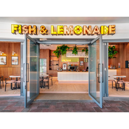
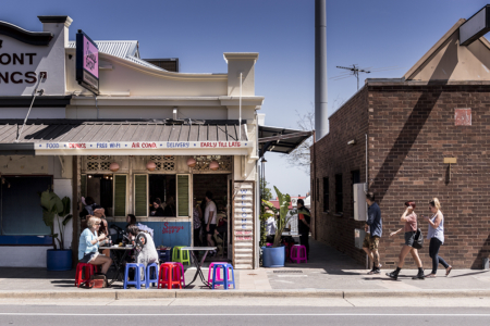
The brief for this fish & chip QSR was “no blue and white, no fish, no nets, no reference to the ocean. We want to stand out and not be the expected fish & chip venue.” We wanted to have fun with the branding and packaging that would resonate with customers, we did this with…
Read MoreProduct
Lightning Minds
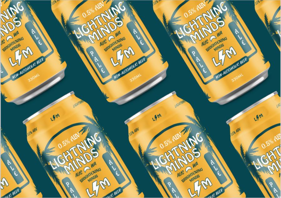
Lightning minds want to build around a community of people who see how positive and rewarding it is not to be controlled by alcohol. Lightning minds voice is honest and jovial. The brand doesn’t take itself too seriously but is very serious about its message. Lightning minds customers are people who have decided to abstain…
Read MoreMonopole
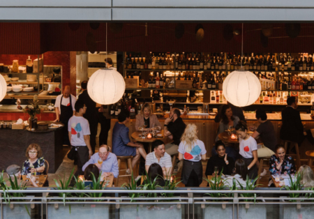
The Bentley Group relocated and wanted to rebrand their award-winning Monopole restaurant from Potts Point Sydney to the Sydney CBD. A light-filled spaced needed a playful casual approach. The shapes used throughout are in reference the Calder inspired mobiles that feature in the venues, these have been used across all collateral and uniforms as well…
Read MoreRia PIZZA + WINE
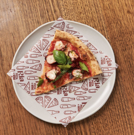
The Bentley Group approached FOLKE ARMY in creating the branding for their new restaurant concept. Ria PIZZA + WINE is new direction for the group as they have always played in the high end of dinning, By bringing their highly respected and awarded pedigree to pizza + wine it needed to stand out and not…
Read MoreMilton Eggs
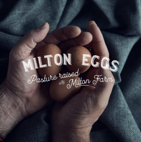
Milton Eggs are pasture-raised at Milton Farm. There are 60 hens per hectare and they will be free to roam the paddocks between sunrise and sunset, protected by Maremma shepherd dogs. At night, they roost in Chicken Caravans and also lay/nest inside the caravans. These are moved once or twice a week, so as to…
Read MoreEasy Tea
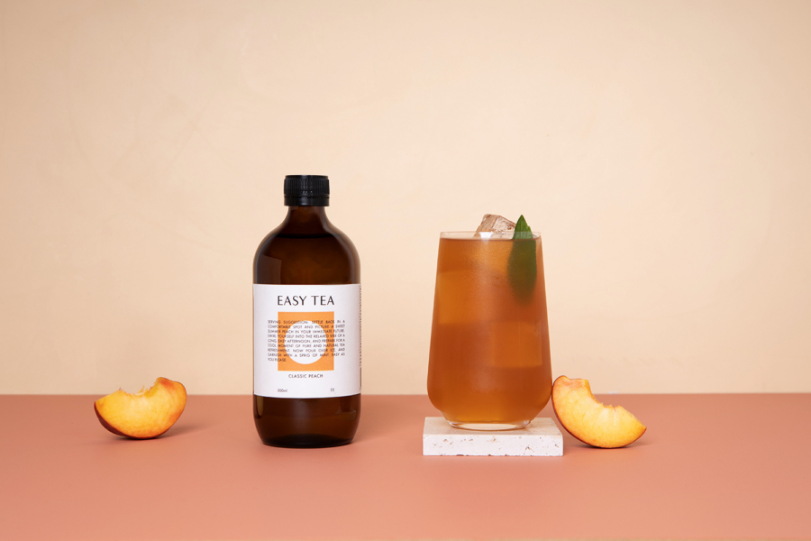
Easy Tea is a sophisticated Iced Tea targeted at experienced diners as an alternative to Alcohol. An alternative that’s not too sweet and full of sugar. The brand traits are Simplicity, coolness, refreshment & effortlessness. We embraced with whole heartily in the branding with clearing showing we are not a supermarket Iced Tea brand and…
Read MorePaul Kelly Design
Paul Kelly Design is a leading interior architectural firm in Australia focusing on hospitality venues from Fine dinning to mega pubs. I wanted the branding to represent architectural plans and the idea of piecing elements together to create the end product to reflect PKD’s practice.
Read MoreBedouin Coffee
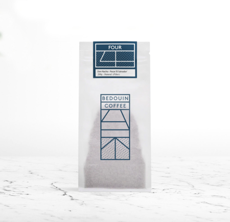
Bedouin Coffee is a new roaster based in London. Bedouin uses the purest water by using the waste from beer brewery and top coffee seeds from South America and Africa. Bedouin is stocked exclusively in their parent company’s (The Initiative Group) venues for the first 12 months to refine and perfect their operation before they…
Read MoreThe Longueville Hotel
The Longueville Hotel is an institution in Sydney’s Lower North Shore. PKD / Paul Kelly Design was given the task of updating the venue with a modernised nostalgia of Palm Springs in the 50’s. The brief supplied to Folke Army was retro feminine with glimmers of another era for all internal branding & signage. As…
Read MoreBotanica
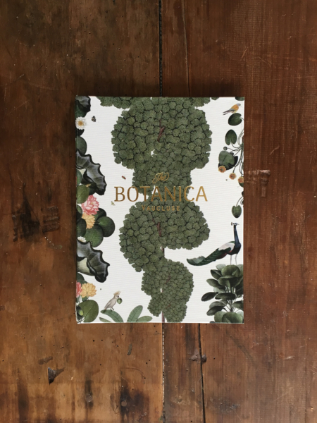
Botanica Restaurant in Sydney’s Vaucluse is set amongst a mini farm with vegetables, herbs & spices grown on site along with a range citrus trees. The brief was to create a strong icon and logo to represent the garden surroundings as well as keeping a strong focus on the core demographic of affluent women.
Read MoreBistecca
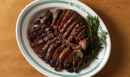
Bistecca is an Italian classic cocktail bar and restaurant by liquid & Larder (Burgerhood), dedicated to Tuscany’s revered cut of steak, bistecca alla Fiorentina, and Italian grape varieties. Spanning three distinct spaces in a heritage-fronted building Sydney Australia, Bistecca delivers the ambience and bravado of Italy’s famed ristoranti and enoteche via a cocktail bar, 50-seat…
Read MoreThe Surfrider Malibu
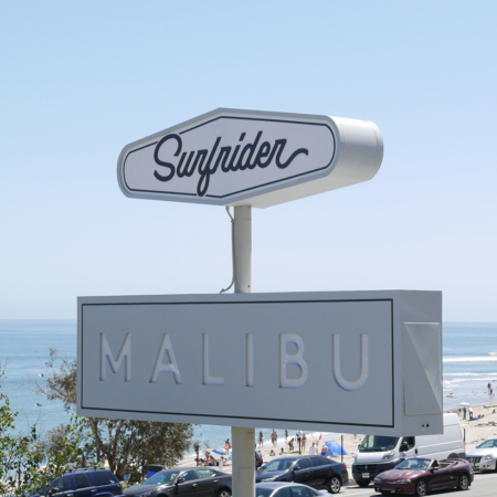
Located on the iconic Pacific Coast Highway, across the street from the world-famous Surfrider beach, The Surfrider is a modern California Beach House, inspired by the picturesque Malibu landscape and rich heritage of California surf culture. Personifying Malibu’s historic beach-town community, the complete redesign of the original 1950s-era motel has transformed The Surfrider into a contemporary…
Read MoreBetty’s Burgers and Concrete Co.
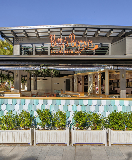
The brief provided was 1950-1960’s Americana beach burger shack. We interpreted this with the use of custom typography and colour palette, along with the styling of the secondary language icons and patterns. As Betty’s is a rapidly growing business, with 8 stores opened within 2 years (and many more to come), the collateral & packing…
Read MoreThe Broad Place Products
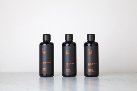
The Broad Place has a wide range of product inspired by Ayurveda – an ancient mind body science still commonly practiced in both the East and West today. Our mission was to redefine the common branding of Ayurvedic products while honouring this ancient tradition and methodology. Folke Army helped develop a number of products, along…
Read MoreThe Grounds of Alexandria
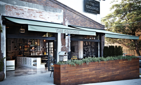
The owners approached FOLKE ARMY during the very early stages of their concept, where we developed and enhanced not only the brand but the user experience on every level. This spanned the graphic design for the entire venue, product design, uniform design and production, launch, press management, advertising and staff acquisition and training.
Read MoreBabicka Original Wormwood Vodka
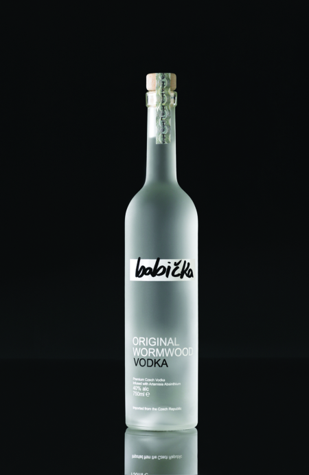
Babicka was born whilst Arran Russell and his business partner Alex Clarke travelled the Czech Republic. Inspired by tales of the mystical wormwood plant and the Babickas who harvested it for use in their incantations. In the mystic history of Czechoslovakia, a Babicka was the term used to identify a group of 16th century grandmothers…
Read MoreMothers Mind Cleanse Book
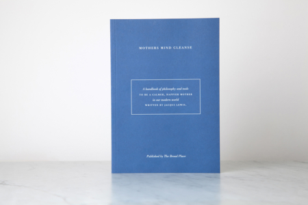
Developed and written by Jacqui Lewis the Mothers Mind Cleanse is a guide book for the modern mother. The authors depth of knowledge and commitment to delivering philosophy and tools to inspire people to live better with more clarity and fulfilment, gave birth to this book. In the design, we were dedicated to keeping true to the…
Read MoreSunny’s Shop
The creators of Sunny’s Shop are passionate about taking their customers on an adventure through the diversity of the tastes of South East Asia. Sunny’s has their unique flavour in the Asian street food market as they recreate an authentic feeling of a quiet neighbourhood eatery in the Mekong whilst tucked away in the quiet and…
Read MoreCho Cho San
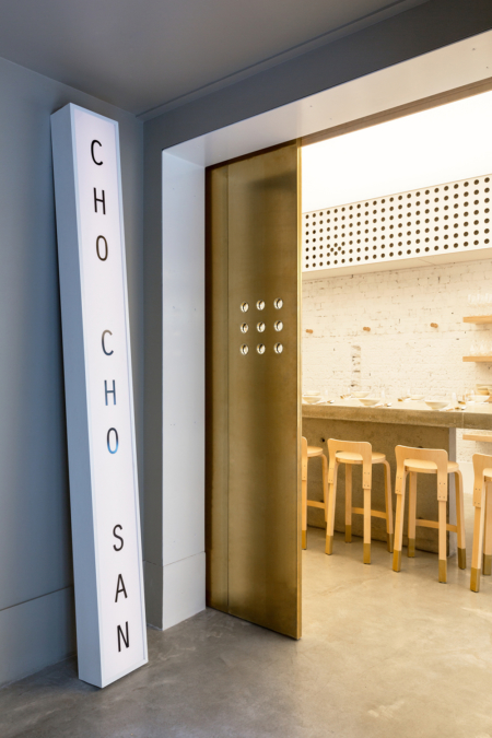
The owners of Cho Cho San were inspired to bring a unique side of Japanese food and beverage culture to Sydney. Inspired by an izakaya style of fun and lively dinning they created an environment and menu thats lends itself to this. We came on board with them to construct a modern and fresh brand with subtle…
Read MoreBondi Wash
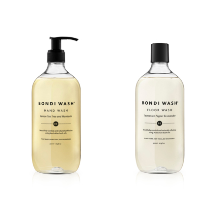
Bondi Wash is plant based product line for your home, Skin, Pets and air. Using only Australian Botanicals as the ingredients. We helped Bondi Wash with their branding, packaging styling, directing photo shots as well as the website.
Read MorePotato Ghetto
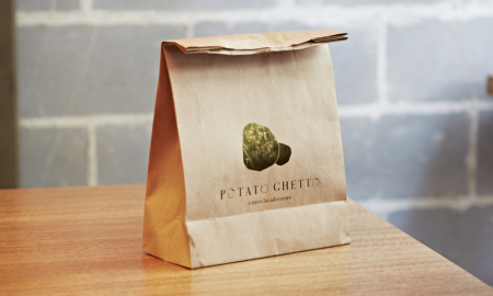
Potato Ghetto is a tuck-shop style venue located in the heart of Bondi. They are dedicated to providing quality comfort food with an emphasis on convenience, health and flavour. As the sister store to Miss Chu’s it was important to design a brand that aligned with the blend of modern and traditional tones they’re known…
Read MoreSalt Meats Cheese
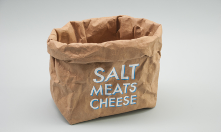
Salt Meats Cheese was established in 2012 and quickly expanded opening stores all over Sydney and in the Gold Coast. Involved in Art Direction, Creative Direction and Graphic Design we worked with the growing business on developing their brand. We designed their packaging, menus, illustration, all collateral design and both internal and external signage.
Read MoreVanishing Elephant Advertising Campaigns
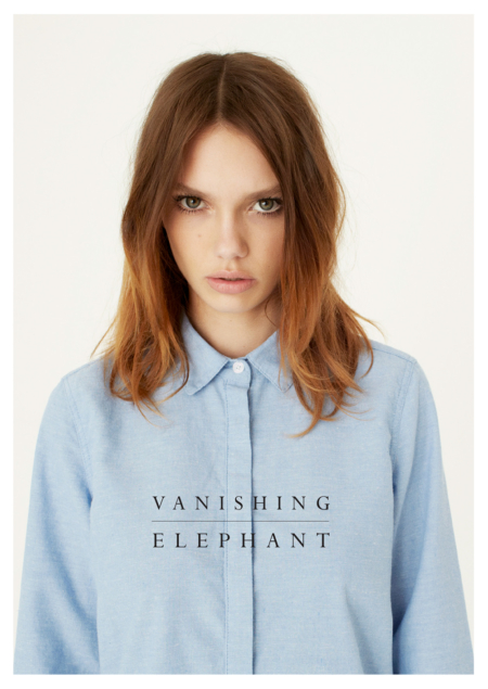
Arran and 2 friends launched VE in 2009 as a full collection fashion brand with instant success and global retailers. Arran designed and art directed all campaigns and catalogues. These are a small selection of some pages.
Read More
